I like the app’s icon and the color scheme. I like the fonts used.
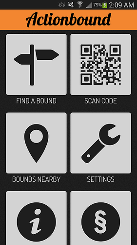
When I open the app, I see this page:
The top left is perfect for „find a bound,“ and the graphic is great.
Next at top is the code scanner. That’s good to have on the primary screen.
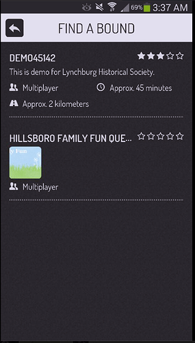
Next line down is the nearby bounds. I have a question or suggestion for that. If the list of bounds loads first, instead of the map, would it be faster? Also, if the list were to be shown, the map icon at top right should attract a new users attention more than the list icon shown with the map page. Also, on the map page, it is a different experience for a user in an area with few bounds compared to a user in an area with many bounds. Therefore, could the player adjust the setting in the app to increase or decrease the range of what is considered to be nearby? Also, would it be possible on the map page to have a different color for the bounds that have been completed, and perhaps the list page could include a checkmark icon and a date to indicate the player has completed it, and the last date and time that it was completed?
Next is settings. I love the big wrench. There could always be more things under settings, but I’m just critiquing the main screen’s appearance.
Next is info. Either a little letter i, or a question mark would work well. I’m not sure which would be more universal. Bottom of main screen is perfect placement.
Next is legal info. I think that should be moved to within the info page. Also, the settings page should have the option to select the player’s language, and then the info page and subpage should all be translated.
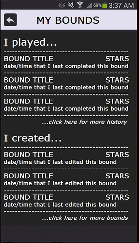
What would work best in the spot where the legal info is now? How about a record or history? The player might like to see a list of all the bounds they have played. This could be per the app download, or you could use accounts to track that info and the app would need to access that information from your server. That tracking of player stats could be a useful feature that people would be willing to pay for, if you’re looking for ways to generate revenue.
The graphic at bottom is not necessary, I think. I would rather have the large graphics and cool color scheme, and the logo at the top. I would prefer a page that is fully shown, without a need to scroll down.
That’s all for now.
